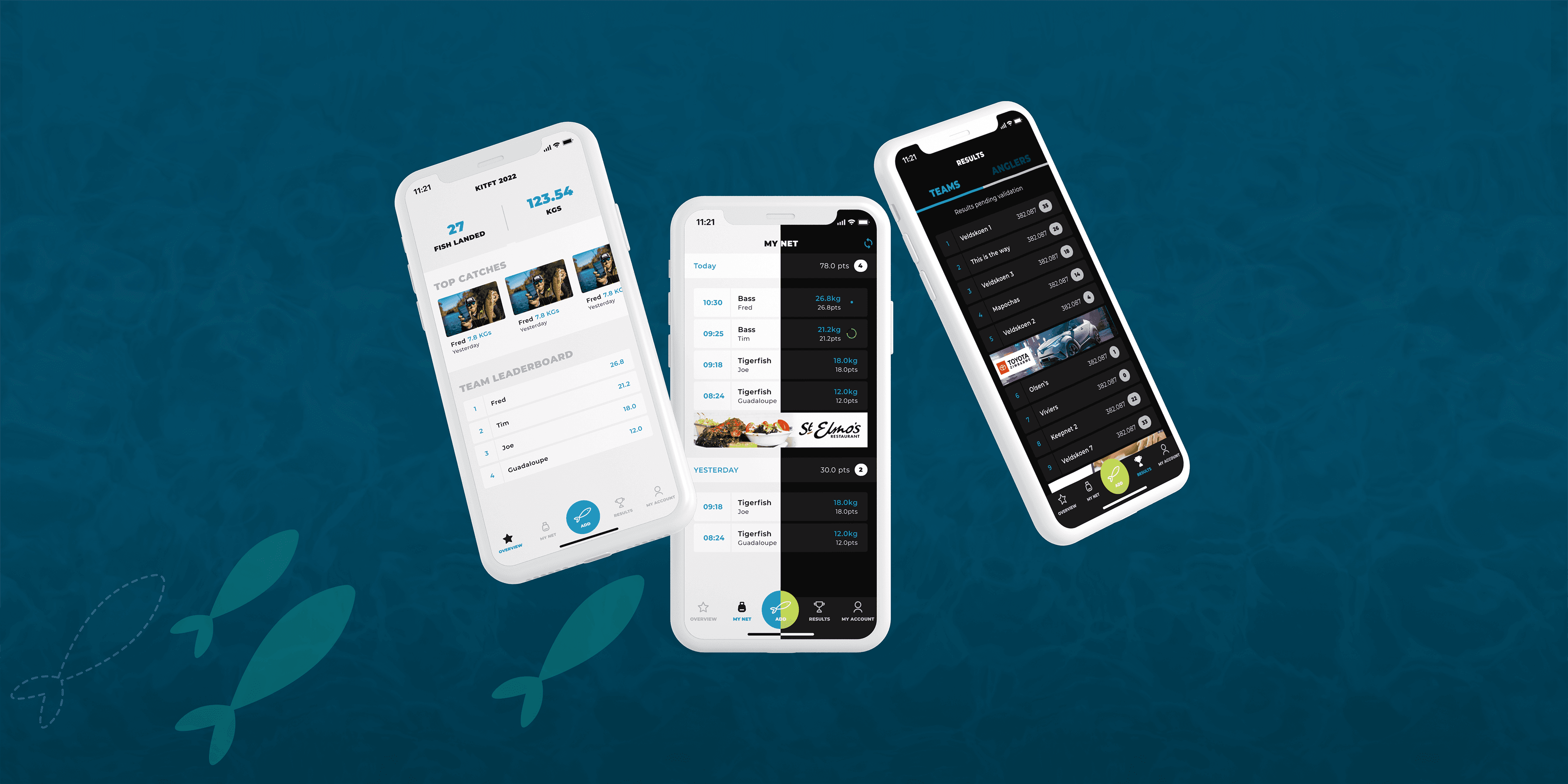
Maintain flawless visual consistency and speed up engineering workflows with centralised, tokenised design systems built in Figma.
01 // OVERVIEW
The Overview
As software products grow, visual inconsistency and UI debt become major speed bumps for product and engineering teams. Our Visual Design and Design System service establishes a single source of design truth. We build comprehensive, tokenised design libraries in Figma that empower your developers to ship new features faster while keeping every screen visually unified.
02 // CAPABILITIES
Tokenised UI Component Libraries:
Standardised Figma components (buttons, modals, inputs, tables, navigation) using variable tokens for fast styling updates.

02
Design System Documentation:
Step-by-step documentation covering component usage, state behaviours, spacing systems, and accessibility standards.

03
Dark Mode & Theme Systems:
Multi-theme component setups that allow instant switching between light, dark, and brand-specific colour modes.

04
Figma-to-Code Asset Synchronisation:
Alignment between Figma design tokens and CSS/Tailwind frontend codebases to streamline developer handoffs.

03 // PROCESS
01
50% Faster Feature Launches:
Developers re-use pre-built, tested components instead of building UI from scratch.

02
Zero Visual Drift:
Keep your web app, mobile app, and marketing pages looking cohesive as your team grows.

Tired of visual inconsistencies across your product?
Let’s build a custom design system that accelerates your design and development speed.
// RELATED WORK